Intro to Design Thinking
|
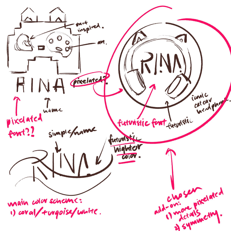
To the left: thumbnails
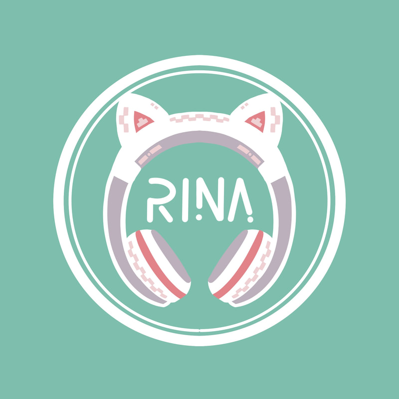
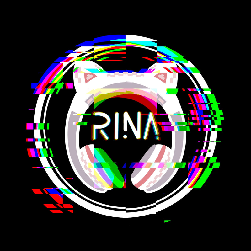
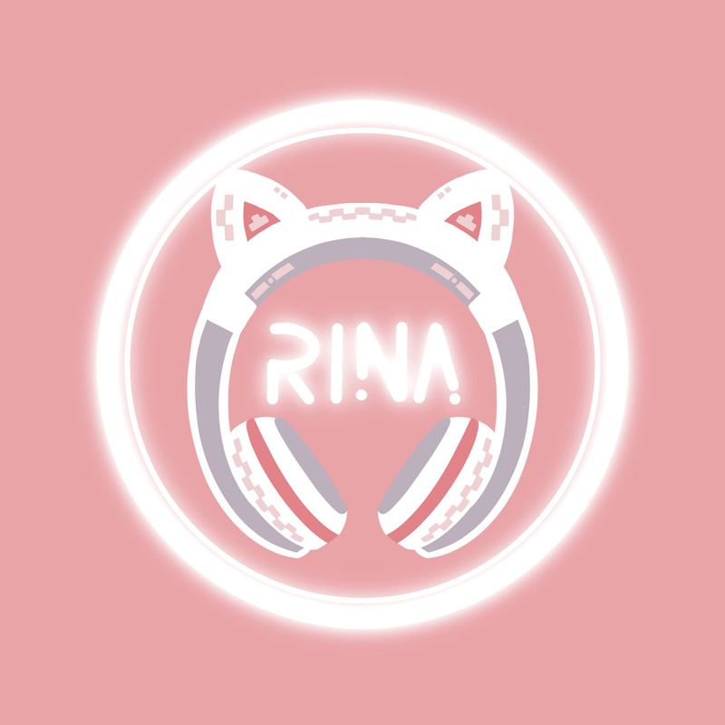
Below (from left to right): The chosen design and two other variations that creates different style for the logo |
|
|
|
For this project, I partnered up with my friend Rina. She likes to game and has always had a cat ear headphone. So I chose these two as the main elements in this design. On the headphone, I drew some checker pattern to give the logo some cyber punk detailing. I also went with her favorite color palette, which is turquoise and pink. After I made the initial design (left). I played around with blending mode and effect and created two variation of the same logo in case she is looking for something more bolder (middle) or something more mellow (right).
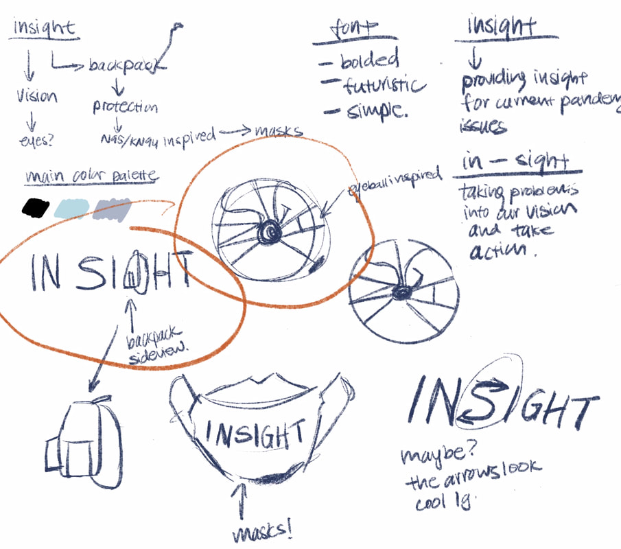
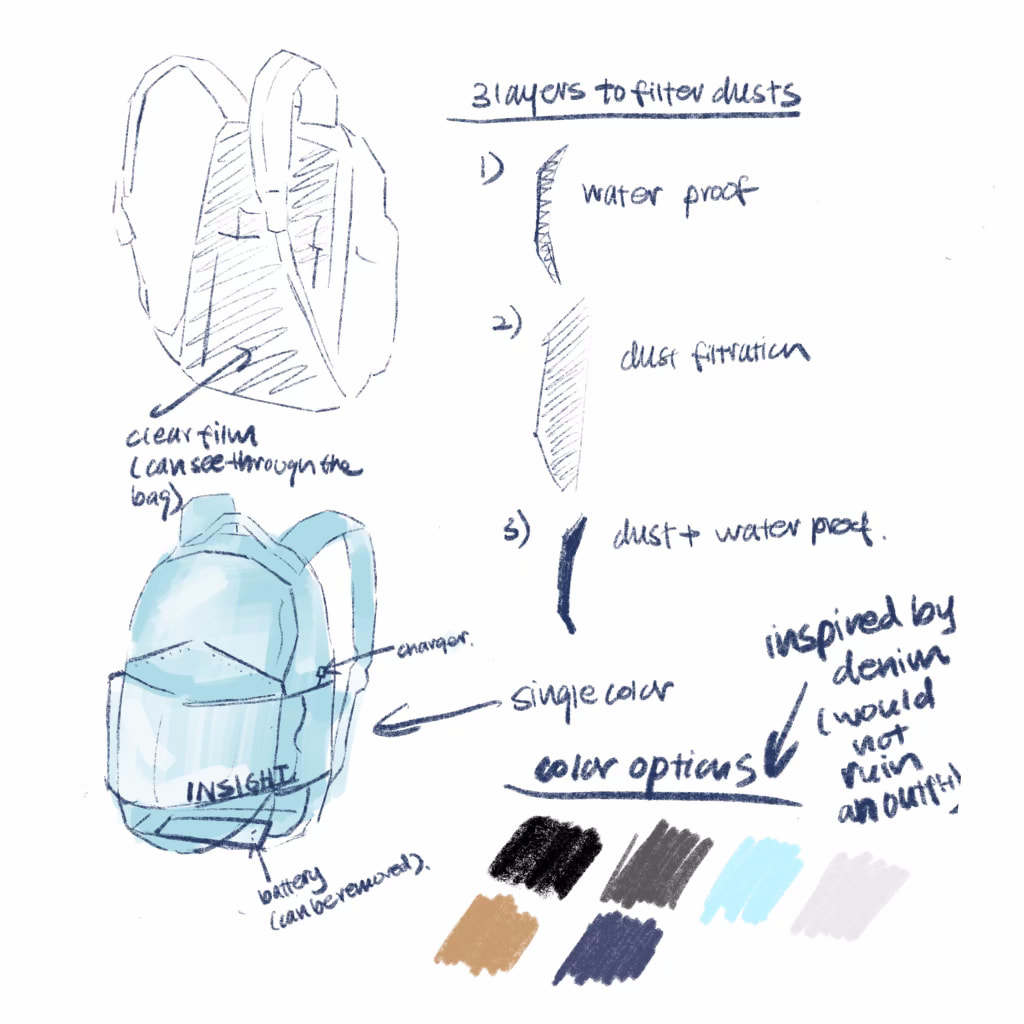
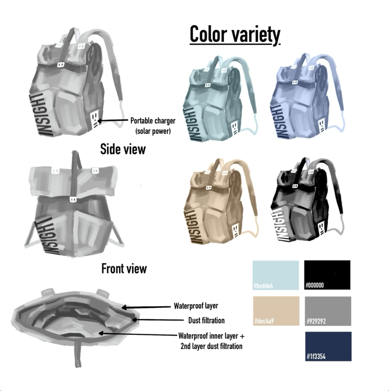
Backpack Redesign
|
|
|
My contribution to the project ^
I was in a team of 4 for this project. We divided our tasks according to our strength and interest. I was assigned to make the line sheet of the final backpack design because I have a passion for digital illustration. I also participated in logo design and backpack designing as my whole team participated in those two essential parts. I also helped the team put together the slideshow into a cohesive format.
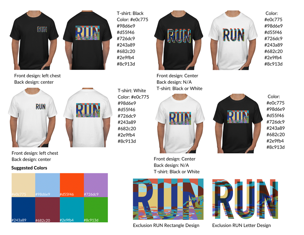
Fleet Feet Collaboration
|
|
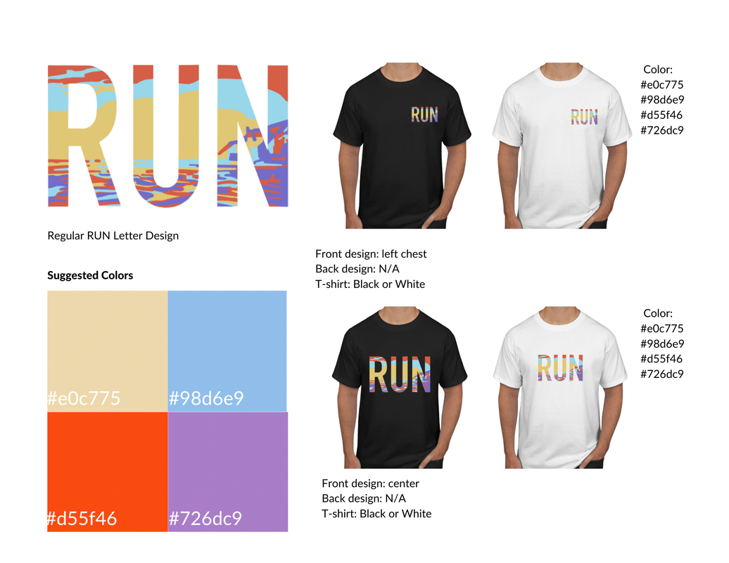
In this project, I gained inspiration from the locality of Fleet Feet. So I chose a picture of del mar beach and overlaid the vectorized landscape with the word "run." Then I used the exclusion effect to make the design more bold and bright. In this project I put a lot of effort into creating the line sheet and making mockups on shirts.
SDRVC Patches Design
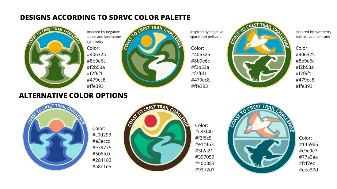
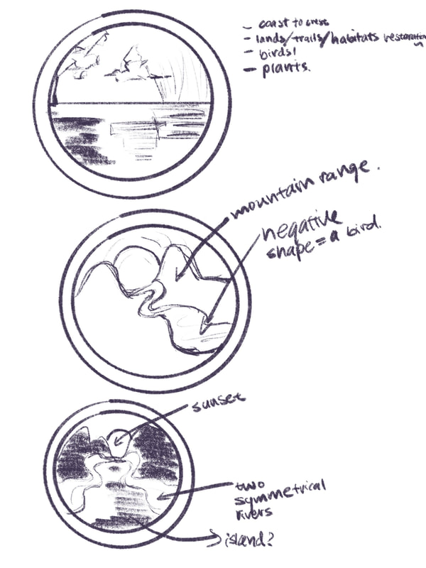
I explored the use of guidance line for symmetry, color palette designing, and use of elements of design in digital design. In the first design (left), I used symmetry line to guide my illustration. And I used the negative spaces of the mountain and the river to render the silhouette of a pelican, which is SDRVC's mascot. In the second design (middle), I also used negative space and asymmetry in my design. In the third design, I tried to incorporate balance into the design by rendering a pelican flying over its reflection in the water. The top row of the line sheet shows the patch designs in the SDRVC designated color palette. The bottom row features each design in my own color palette. I also learned how to organize line sheet in this project.
|
|
Poem Interpretation
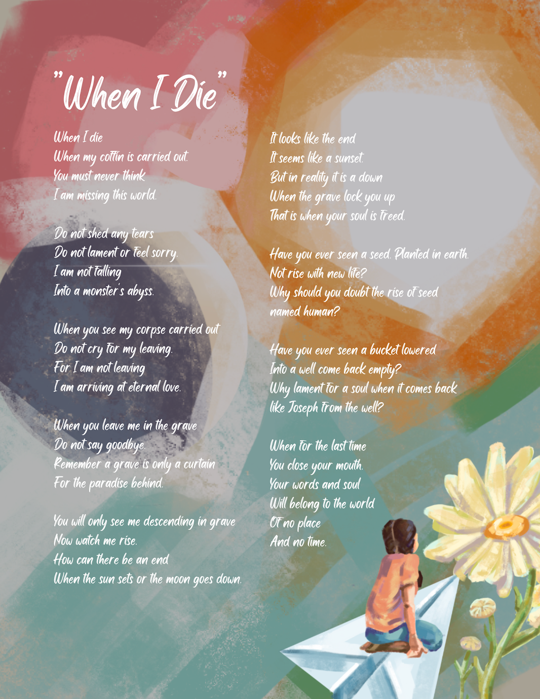
In this project, I explored digital illustration by digitally painting and designing the girl that is riding on a paper airplane. The whole project is digitally illustrated, and I used dark layer with light opacity to weaken the brightness of the background.
Sci-fi Poster
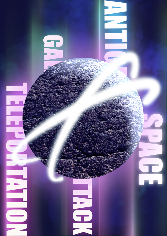
In this project, I designed glowing fonts by myself to reinforce the sci-fi style of the poster. I created the glowing font by making duplicate of the text and blur the bottom layer with gaussian blur. I also added texture on the planet by using clipping mask layers.
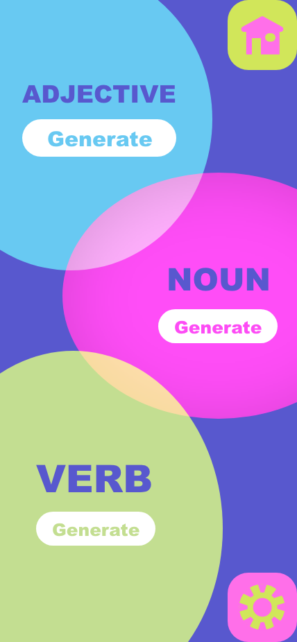
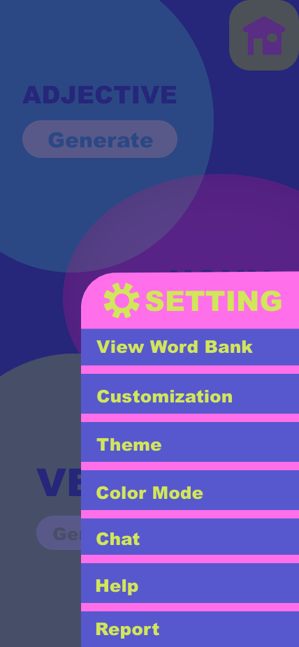
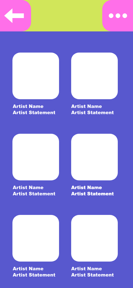
APP For Social Good
My App is targeted to alleviate art originality issues in the community. Through generating random word combos that induce creativity and build a community of original art artists, I hope to help artists to get into the habit of creating original art.
|
|
|
|
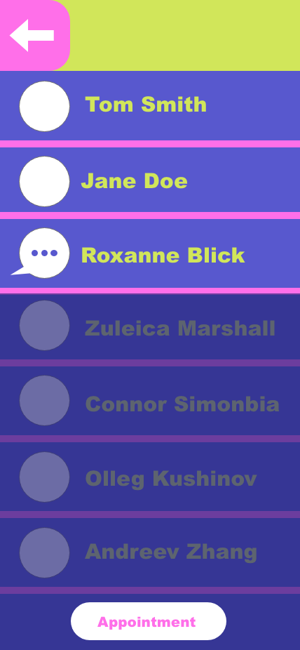
In this project, I used Adobe Xd to create these screens for my app. This app gives artist inspiration for daily sketchbook practices and promote originality of artworks. The first screen shows that the app opens to a screen that has three bubbles. When you click "generate," a word will appear in each bubble. Connecting all three bubbles, the artist can get a theme for their art (ex: happy cat sleeping). The second screen shows all the different customization options and setting options. Users can customize the display of the app or draft their own word bank to make the app better suit their needs. The third screen is a display of the community building aspect of the app. Users can share their prompt and artwork to showcase their original art. The fourth screen features the special online instruction option of the app. Without paying or going outside, users can get 1 on 1 instruction on their art and improve! Throughout this project, I played around with bright color palette designing, blending mode, alignment in Xd, and vectored icon making.
Branding Project
In this project, I created my own fictional brand called Sweam. Sweam is a coffee brand that aims to bring comfort to coffee lovers. Caffeine sensitivity and sleeplessness are often reasons that people have to put off their cup of coffee. But with Sweam, our coffee will be decaffeinated and feature a smooth texture that bring people satisfaction without worrying about the effect of caffeine. One problem that I have also noticed is that there are more and more night workers nowadays. At night very few, or close to none, of the cafe are open to offer night workers a soothing, safe environment to rest in. So Sweam will be a 24 hrs store that not only bring the customers coffee, but also a comforting safe place. I learned how to make mockups and generate a cohesive palette in this project.
